Product pages are one of the most important parts of your online store. This is where shoppers learn about your offerings and decide if they’re worth adding to cart. With a well-optimized WooCommerce product page, you can build trust with customers, improve SEO, and enhance the overall shopping experience.
This is exactly what we’ll learn about today. In this complete guide, we’ll walk you through 10 simple yet impactful steps you can take today to optimize your WooCommerce product pages. We’ll also introduce you to helpful tools that can make the process faster and easier.
Exciting, right? Let’s get started!
What Is A WooCommerce Product Page?
If you’ve ever shopped online and clicked on an item to read more about it, you’ve been on a product page. It’s the exact same thing in WooCommerce! Each product you list on your WooCommerce store automatically gets its own page. You can customize these pages to showcase the best features of your products and encourage shoppers to try them out.
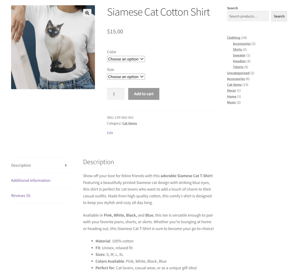
Here’s what you’ll usually find on a WooCommerce product page:
- Product name: What the item is called
- Price: How much it costs
- Product description: Details about the item, like size, features, or how it’s used
- Photos: Images that show what the product looks like (some stores also add videos!)
- Add to Cart button: The button shoppers click to add the item to their cart
- Product variations: Different sizes, colors, or variations of your products can also be displayed on the product page
- Customer reviews: What other buyers have said about the product
- Product tags or categories: This groups similar items together
- Related products: Other items shoppers might also like (great for cross-selling)
Why You Should Optimize Your WooCommerce Product Page
Taking the time to improve your WooCommerce product pages can make a huge difference to your store’s performance. According to industry insights, a whopping 85% of shoppers consider product information and images crucial factors when deciding which brand they’ll buy from!
By optimizing your product pages, you can:
- Help shoppers feel more confident: Having clear, informative, and easy-to-navigate product pages makes shoppers feel more confident about making a purchase. This is especially important if it’s their first time buying from your brand. By reducing doubts and hesitation, you can lower cart abandonment and encourage more checkouts.
- Improves SEO: Product pages that feature SEO-optimized product titles and descriptions show up better in search engine results. This can help increase your organic traffic and visibility.
- Reduces support questions: When your page already answers common questions (such as sizing, materials, or shipping times), you’ll get fewer customer questions. This helps improve the shopping experience while also freeing up precious time for you and your support team.
- Enhances the overall shopping experience: Well-organized product titles, categories, and product tags make it easier for shoppers to find out what they’re looking for.
Effective Ways To Optimize Your WooCommerce Product Page
At this point, we have uncovered why it’s crucial to optimize your WooCommerce product pages. Thankfully, there are smart strategies you can implement today to make your product pages more appealing and easier for customers to understand. Thanks to tools like StoreAgent, a few can even be automated to save you effort along the way!
Let’s get right into it.
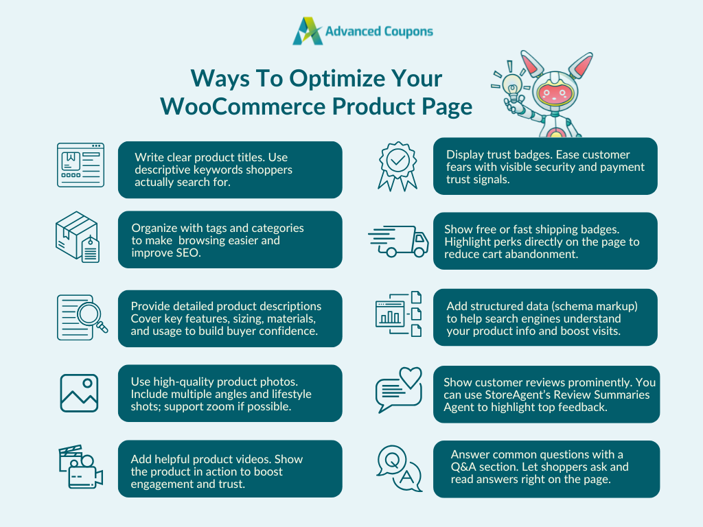
1. Write clear product titles
This might seem like a no-brainer, but it’s something many store owners overlook. Your product title is one of the first things both shoppers and search engines see, so it should be clear, specific, and easy to understand.
Here’s a quick tip: Instead of using broad labels like “hats” or “shoes,” go for terms that describe exactly what the item is, like “baseball cap” or “women’s leather sandals.” This helps your products show up in search results and makes it easier for customers to find what they’re looking for.
The more specific your product titles are, the faster shoppers can understand what you’re offering. To make browsing even smoother, it’s also a good idea to group similar items under relevant categories.
That brings us to the next strategy…
2. Organize with product tags and categories
Don’t overlook adding product tags and categories. While they might seem like a small thing, they play a big role in helping customers find what they’re looking for. Tags help showcase related items, while product categories make it easier to browse through your store. They’re also crucial for SEO!
💡 POWER TIP: If you have a large product catalog, consider using an AI tool to automatically generate product tags for you. StoreAgent’s Product Tag Generator can help you create relevant, keyword-friendly tags in just a few clicks instead of manually adding tags to every product.
3. Provide detailed product descriptions
In a physical store, shoppers can ask a sales associate questions or examine the product up close. But online, your product description has to do all the talking. In fact, 87% of online consumers consider product descriptions to be crucial when deciding to purchase!
That’s why it’s so important to make your product descriptions clear, complete, and easy to understand. Cover everything a customer might want to know, from key features, materials, sizing, usage, and even care instructions.
If you’re managing a large catalog, writing descriptions for every item can be time-consuming. This is where AI-powered tools like StoreAgent can help. StoreAgent’s Product Description Assistant saves you hours of work and helps you generate high-quality, SEO-friendly descriptions based on a few key details! Check it out in action:
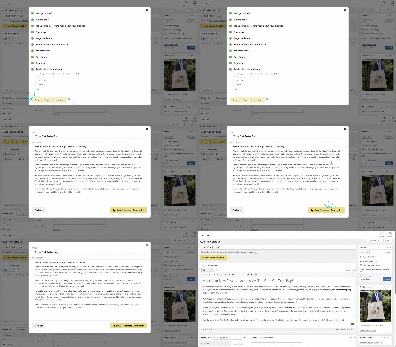
Remember, the goal is to make customers feel like they know exactly what they’re getting, giving them the confidence to click “Add to Cart.”
4. Use high-quality product photos
Shoppers rely on product photos to understand what they’re buying, especially since they can’t see or touch the item in person. According to industry estimates, 75% of online shoppers rely on product photos to make buying decisions. That’s why using clear, high-resolution images is so important.
Avoid low-quality or blurry photos, and make sure each product has multiple angles if possible. If your store theme supports it, allow shoppers to zoom in on images for a closer look. Lifestyle photos or pictures that show the product in use can also help customers imagine how it fits into their daily lives.
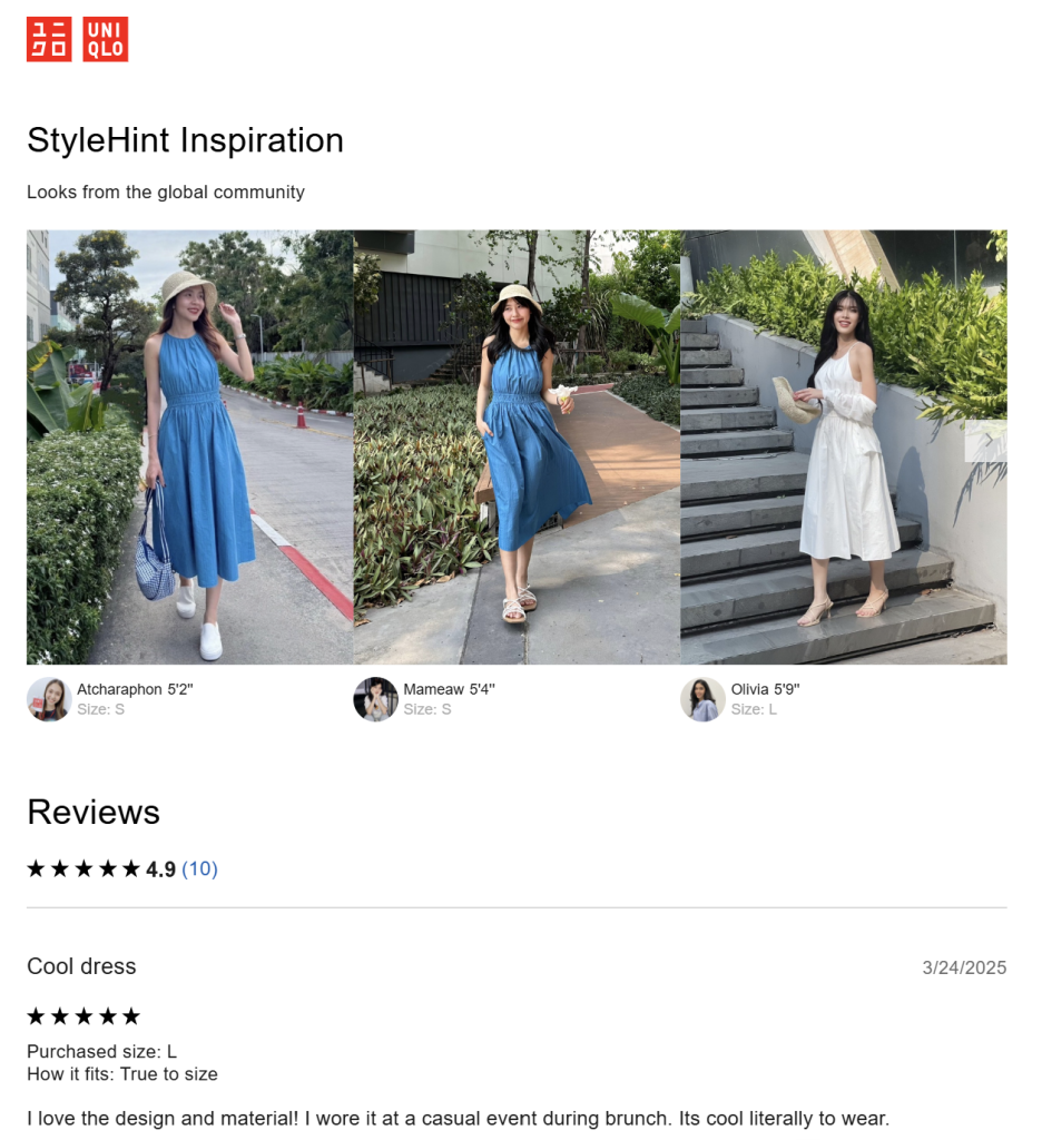
Some brands even showcase user-generated content, where real customers upload photos of themselves using or wearing the product. This adds authenticity and makes your product pages feel more trustworthy. Take a look at this example from Uniqlo:
5. Add helpful product videos
Not every product needs a video, but for certain items, a short demo can go a long way.
If a customer could benefit from a video or a video demonstration, you’ll increase engagement and better yet, sales. Even a quick clip showing how the product looks in real life or how it’s used day-to-day can make a big difference in driving conversions.
6. Display trust badges
With the proliferation of phishing and scam sites, gaining the trust of your customers and visitors is crucial. If you want them to share personal information with you, like their credit card information, they should have an assurance that you are legit. If you have the means to put them at ease, use them.

Do you have a problem with cart abandonment? The reason could be that customers are unsure about the security of your site and simply don’t trust you with their credit cards.
In 2017, 19% of cart abandonment at checkout was due to this very reason. So calm the fears of your customers. Let them know you’re following best practices when it comes to cybersecurity and that their payment information isn’t in jeopardy. Adding a trust badge will give them this assurance.
7. Show free or fast shipping badges
Shipping costs are one of the top causes of cart abandonment. If you offer free shipping or expedited delivery, it’s always a great a idea to display them directly on your product pages.
Adding a visible badge lets customers know right away. These visual cues give customers peace of mind and remove one more reason to delay their purchase.
🎯 POWER TIP: Tools like Advanced Coupons make it easy to create compelling free shipping offers and shipping discounts. With this plugin, you can set cart conditions (like minimum spend or product categories) and automatically apply free shipping when those conditions are met.
8. Add structured data (schema markup)
Every product page should include structured data, also called schema markup.
Schema markup is a type of code that helps search engines understand the content of your pages. For product pages, this can include details like the product name, price, rating, availability, and more.
Have you ever done a Google search and right at the top of the SERP is a website where you just don’t have the typical link to the corresponding webpage, but a layout of the company plus some of its top pages or categories?
Like this, for example?
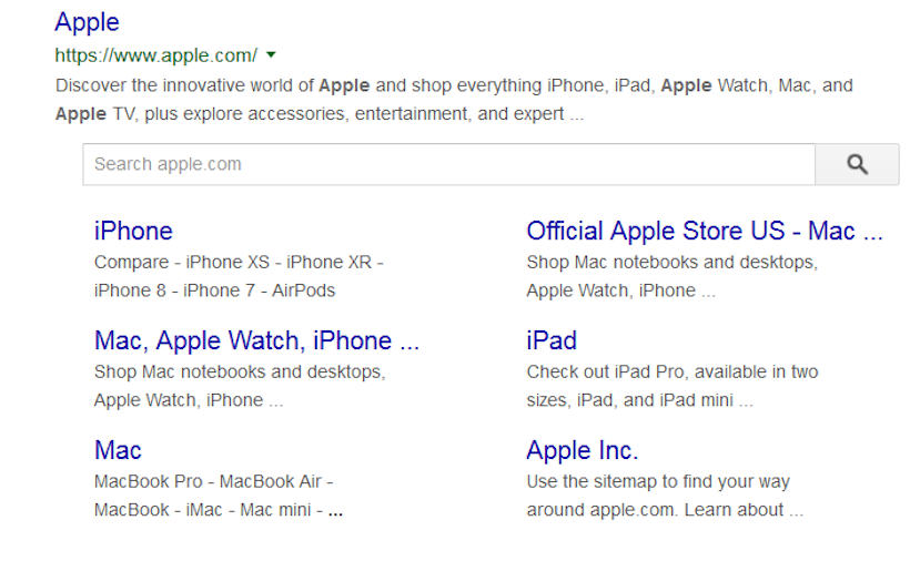
That’s how your site would look in the SERPS if you’ve added structured data.
The benefits are twofold. First, Google and other search engines are able to understand what your content is about. In this case your product pages. Secondly, when users search they will see the value of your site at a glance, right there in the SERPS.
To add structured data to your WooCommerce product pages, you can:
- Use an SEO plugin like AIOSEO
- Add schema manually using code (best for advanced users)
Once you’ve added schema, you can test if it’s working using Google’s Rich Results Test tool. It’ll show you exactly what information is being picked up by search engines.
9. Show customer reviews prominently
Product reviews are one of the strongest forms of social proof! Shoppers often want to know what other people think before making a purchase. According to industry insights, 92% of customers feel hesitant to buy when there are no customer reviews available.
Since, of course, you have glowing product reviews, you don’t want them hidden somewhere on your site! They should be easy to find and easy to read on your product pages. Otherwise, you could be missing out on potential conversions.
That said, not every shopper has time to scroll through dozens of reviews. This is where tools like StoreAgent’s Review Summaries Agent can help. This tool automatically scans your reviews and displays short summaries that highlight key themes and overall star ratings:
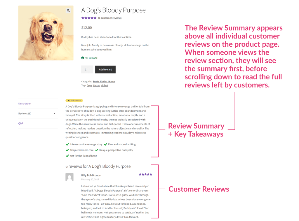
As a result, shoppers get a quick snapshot of what others are saying, boosting their confidence to buy from your store.
If you haven’t been collecting reviews, it’s time to start. Not sure where to start? We have a bit of a guide on how to get reviews right here.
10. Answer common questions with a Q&A section
Even with a detailed product description, shoppers might have some questions before they’re fully ready to buy. If they can’t find the answers quickly, they may hesitate or leave your store altogether.
This is why adding a Q&A section on your product pages can be a smart strategy! By adding a Q&A section, you give curious shoppers a dedicated space to ask specific questions and get answers instantly.
If you don’t want to spend hours answering the same things over and over, tools like StoreAgent’s Product Questions Agent can help. It adds a Q&A tab to your product pages, allowing customers to ask questions and get instant AI-generated answers based on your existing product information.
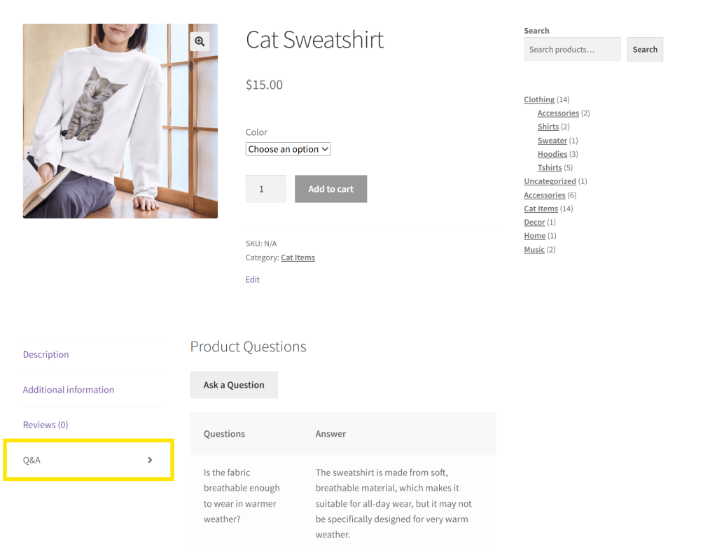
To ensure accuracy, you can review and approve the responses before they’re published. It’s a simple way to keep your product pages informative and interactive without piling more work onto your plate! Pretty cool, right?
If you get all these ten steps in place, your online store is well on the way to offering what brick-and-mortar stores do in terms of visual merchandising!
Frequently Asked Questions
Where is the product page in WooCommerce?
Every product listing in your WooCommerce store has a designated product page. You can view this by clicking the specific product on the shop page or by navigating to the product’s URL.
How to edit WooCommerce product page for free?
Head to your WordPress dashboard and click Products > All Products. Click the “Edit” button on the specific product you want to edit. From here, you can modify the title, description, prices, categories, tags, and more, which are displayed on the product page.
How do I show more Products per page in WooCommerce?
To change the number of products per page, head to your WordPress dashboard > Appearance > Customize. Click WooCommerce > Product Catalog. From here, you can modify the “Products per row” and “Rows per page” options to show more products per page.
Conclusion
If you’re looking to improve your store’s performance, optimizing your product pages is a smart way to start. A well-optimized WooCommerce product page can help positively impact the search engine ranking of your website, boost click-through rates, and eventually, raise sales.
In this article, we explored effective ways to optimize your product pages in WooCommerce:
- Write clear product titles
- Improve product discoverability with tags and categories
- Provide detailed product descriptions
- Use high-quality product photos
- Add helpful product videos
- Display trust badges
- Show free or fast shipping badges
- Add structured data (schema markup)
- Show customer reviews prominently
- Answer common questions with a Q&A section
With the help of tools like StoreAgent, you don’t have to do it all manually. From writing product descriptions to answering customer questions, automation can help you create a better experience without taking up all your time!
Do you have any questions about this topic? Let us know in the comments!

