If you want to increase sales and drive conversions on your online store, it’s important to pay close attention to your WooCommerce product images. Unfortunately, there are a handful of common product image mistakes that site owners make which can hurt their businesses.
However, the good news is that familiarizing yourself with these missteps can help you avoid them. Learning what not to do with your WooCommerce product images can help you enhance your e-commerce store, improve User Experience (UX), and ultimately generate more revenue.
In this post, we’ll start by discussing the critical role your product images play. Then we’ll provide you with a list of 12 of the most common mistakes to avoid. Let’s jump in!
The Importance Of WooCommerce Product Images
The way you display your images on your website is of paramount importance. They let your visitors better understand your product and enable them to get an idea of what to expect.
Using high-quality images can present your brand as professional, credible, and trustworthy. If your shoppers can’t get a solid idea of what the items look like, they won’t be particularly motivated to purchase them.
Your WooCommerce product images, when handled correctly, can help drive sales and increase customer loyalty. They can also help optimize your site for better rankings, boosting traffic and engagement in the process.
12 Product Images Mistakes WooCommerce Store Owners Make
Now that we understand more about why product images are so important, let’s look at what not to do with them. Below are 12 WooCommerce product image mistakes to avoid.
1. Not providing product images at all
It’s essential that all products featured in your WooCommerce store have accompanying images. Otherwise, your customers won’t be able to visualize what they’re buying.
Instead, they’ll only be able to base their perception or decision off of the description and text. This isn’t effective, nor is it visually appealing.
2. Not setting the featured images properly
If your WooCommerce product images aren’t set correctly, it can make your site look unprofessional.
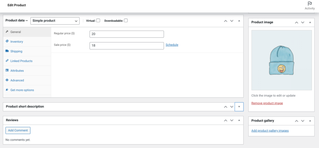
This is particularly important for the primary or featured image, as this is the one that shoppers will see first. In WooCommerce, the primary image will be the one you select as the Product Image:
The main image can make or break their decision to click on the product to learn more about it and browse through other items in your store. If you want to add different viewpoints of the product (which we recommend), you can select Add Product gallery images.
3. Failing to properly size product images
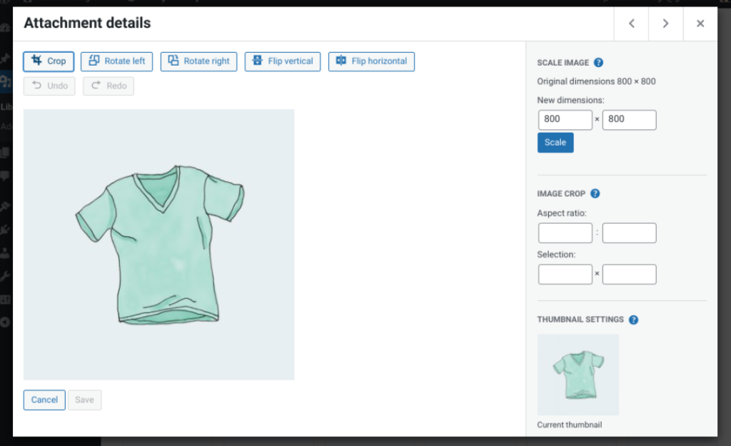
Images that are oddly sized, blurry, or have incorrect dimensions can result in a negative first impression. Your theme should provide more information about what the proper dimensions are for featured images. However, we recommend choosing an image that is at least 800 x 800 pixels (px).
You can resize your images before uploading them or by editing them in your Media Library:
Making sure your images are of the correct resolution and size can portray your products in a better light. After all, if the image of your product is low-quality, why would customers assume the quality of the item itself would be any different?
4. Forgetting to give a zoomed-in view
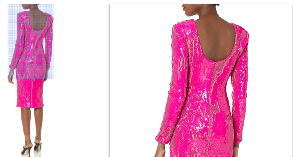
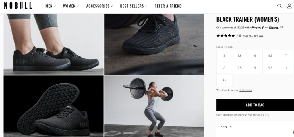
In the same vein as making sure your images are appropriately sized, it’s also essential to ensure you’re giving visitors a close-up view of your products:
People like to see details, especially for aspects of items that they’d typically inspect in person if they’re purchasing offline.
Most people would like to see a close-up of the material of a piece of clothing for example.
Providing this level of insight can help manage expectations. Shoppers would be less likely to be unsatisfied with a product that they found online if they can see the quality up close.
5. Failing to remove the background to make the product pop
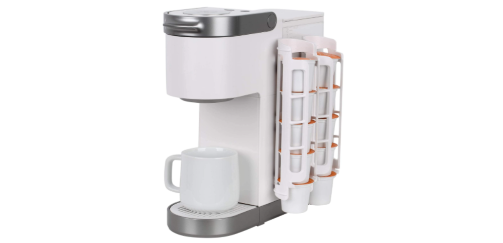
When it comes to WooCommerce product images, it’s important that the items are the main focus. One way to make them pop is to remove the background:
This cuts out any possible distractions and can help the images appear more high-quality and professional. There are services that you can use to remove the background. Most are inexpensive, only costing a couple of dollars. You can also pay someone to do it using a platform such as Upwork.
6. Leaving out a lifestyle photo from the gallery
An effective way to highlight the benefits of your products is by showing them in use.
Therefore, we recommend including a lifestyle photo in your WooCommerce product image galleries that showcase a human wearing or using the item:
It can help provide context and break up the standard product-only images. You can find many examples of this on Amazon product pages.
7. Not optimizing the WooCommerce product images
Images typically have large file sizes. When you have a lot of them, it can hurt the performance and speed of your website, which is why it’s crucial to optimize your images. There are multiple tools you can use to do so.
Some popular examples include Imagify and Smush:
These WordPress plugins make it easy to compress and optimize your images without hurting their quality. You can also optimize them using a software or image optimization service site like TinyPNG before uploading them to your WordPress Media Library.
For a complete walkthrough on balancing quality with performance, you should also learn how to optimize images for SEO to ensure your store remains fast and search-engine friendly.
8. Only showing one viewpoint
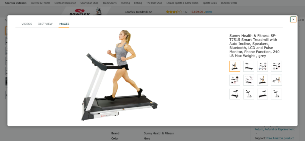
When you want to highlight your products and give shoppers a complete picture of what they look like, it’s important to show multiple viewpoints:
Only displaying one angle can limit customers’ understanding of the item. It also prevents them from getting a full picture of what to expect. Instead, they should be able to browse through different viewpoints and angles to assess the product similarly to how they would in a store.
9. Not using a photo lightbox
A photo lightbox is a box made of non-reflective material. It helps provide a neutral (usually white) backdrop for your product images that cancel any shadows or castings from other light sources:
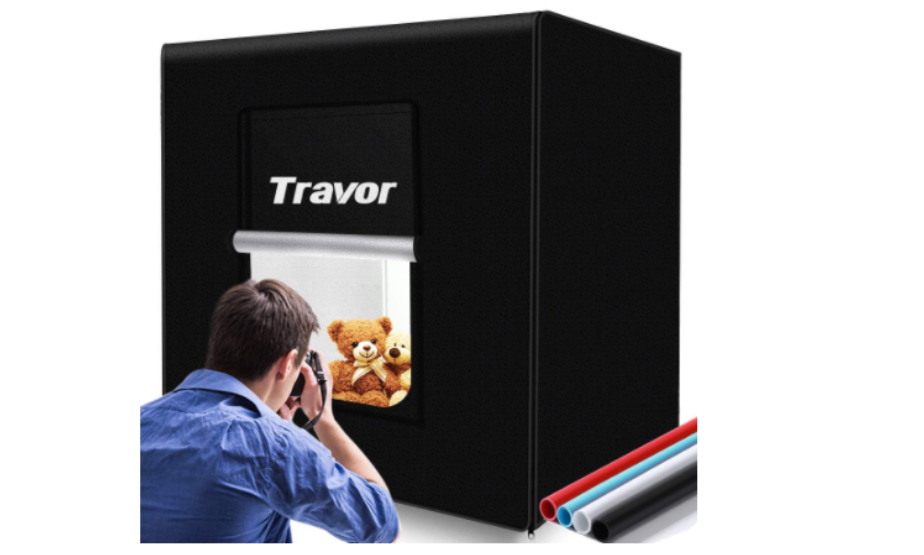
Not using a photo lightbox can result in unprofessional, low-quality images. Therefore, we recommend investing in one, especially if you plan to handle your own photography. Many are available for relatively cheap on Amazon, such as the one shown above.
10. Failing to adjust levels to add contrast and saturation
Editing your WooCommerce product images is crucial to portraying them in the best possible light (literally). Failing to adjust the levels of your photos means you’re not tuning the dark and light points. This is vital for adding contrast and improving saturation.
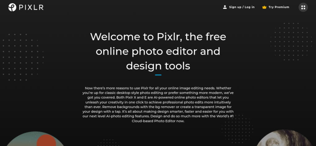
You can easily do this using software such as Photoshop or Lightroom. Alternatively, you can use an online image editing tool such as Pixlr:
If you need some guidance on adjusting and editing your photos, you can check out a YouTube tutorial. There are plenty available for each type of editing software or platform.
11. Forgetting to use a Content Delivery Network (CDN)
Not delivering images from a CDN can hurt the performance of your website. CDNs help seamlessly deliver static files such as images to improve your pages’ speed and loading times.
Failing to use one places an unnecessary burden on your server, resulting in overload and slow image rendering.
There are multiple CDN services to choose from. One we highly recommend is BunnyCDN:
This platform includes a perma-cache feature that permanently stores a copy of your files. It also comes with a SmartEdge™ feature, which routes customers to the most relevant page.
12. Leaving out a 3D view
As we mentioned, it’s a smart idea to include multiple viewpoints on your product images. Including a 3D (or 360) view is also another excellent option.
While this is a relatively new type of product image technology, adopting it can go a long way in helping customers better understand your products and showcasing them in a modern, effective manner:
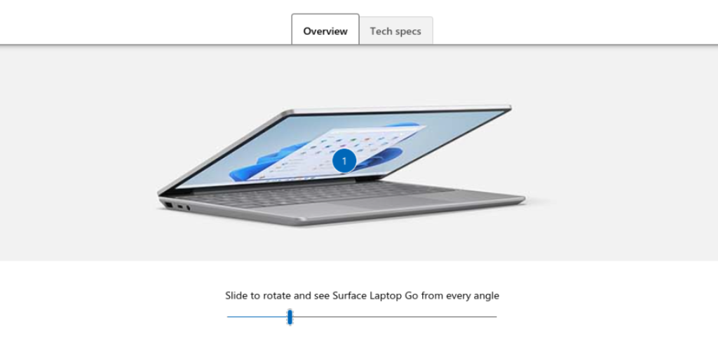
Various tools and services are available that let you generate a 3D view of the product so customers can better visualize them. For example, you could use a platform such as 360 Product Viewer. This tool lets you configure any product via a virtual photo studio into a 3D model.
Conclusion
Your product images play an important role in your WooCommerce store. However, if they’re not properly sized, optimized, and showcased, it can make your brand seem unprofessional and untrustworthy.
As we discussed in this article, there are a wide variety of mistakes you should avoid making with your WooCommerce product images:
- Not providing product images at all
- Not setting the featured images properly
- Failing to properly size product images
- Forgetting to give a zoomed-in view
- Failing to remove the background to make the product pop
- Leaving out a lifestyle photo from the gallery
- Not optimizing the WooCommerce product images
- Only showing one viewpoint
- Not using a photo lightbox
- Failing to adjust levels to add contrast and saturation
- Forgetting to use a Content Delivery Network (CDN)
Do you have any questions about using WooCommerce product images? Let us know in the comments!


