In this post, we’ll focus on five things you should concentrate on to optimize eCommerce website.
Improving your e-commerce website is something that any store owner would be interested in. This article isn’t going to be “light.” We’re talking hardcore vision and tactics here.
Each of the following things will take time to improve and implement. You can’t rush it. It’s going to take you a long time to cover everything here.
Do me a favor – open up your Trello or a Google Doc or whatever you use to keep track of things and have it ready to take notes as you run through this article. There’s a lot of information here, and it will probably spark a few ideas.
Once you’ve brain-dumped everything on the page, you’ll need to pick something. I recommend you go with whatever will be the lowest-hanging fruit for you. This will be different for everyone.
That being said, let’s talk about how to optimize ecommerce website.
5 Things To Focus On When Optimizing Your E-Commerce Website
At the core, optimizing your website is about creating a store that’s easy to use, navigate, and understand. It sounds simple, but there are a few key aspects you need to get right to make this happen. The good news? You don’t have to do it all manually.
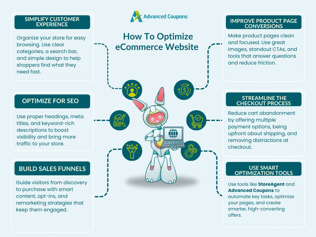
In this section, we’ll break down five key areas you can focus on to improve your overall site performance. Along the way, we’ll introduce you to smart tools that can help you automate time-consuming tasks and keep your store running smoothly with less effort!
1. Simplify the customer experience
The organization of your store is EVERYTHING when you optimize ecommerce website.
If it’s not easy for a brand new customer to navigate your site and find out about your products, you’ll be pushing shit uphill.
Organize your store structure
Your site structure must be easy to visualize, understand, and navigate.
Take a brutally honest look at your site. What would you think if you were brand new to it, having just come from a Google search and landed on the homepage?
Does the first “call to action” jump out at you? Are you using the right call to action?
If you have many products, is there a nice simple way to see all the categories those products belong to?
Your store should have good searchability, and this means two things:
- The site is searchable via a product search box (important if you have lots of products)
- Clear product categories that make sense to your audience
Beyond searching, it’s also important that your category pages and product pages are well-explained. Never underestimate customers and their confusion potential, and avoid providing too much information.
It’s good practice when you optimize ecommerce website to add enough information to a page. This is so that you answer all of the questions you can think of that a customer might get confused about when they’re on that page.
💡 POWER TIP: Tagging products properly improves internal navigation and makes filtering easier. StoreAgent’s Product Tag Generator helps you automate this process, so your store stays well-organized even as your product catalog grows!
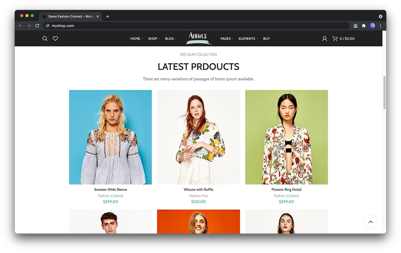
Keep your design clean and professional
Lastly, your site should look nice and be professionally designed to optimize ecommerce website.
Suppose you can’t afford a professional designer (and let’s agree, they can be pricey and out of reach, and your money might be better spent elsewhere). In that case, you should look at a nice templated design to see you through the initial growth period.
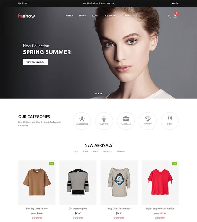
The main thing to look for in a design, in the beginning, is the least complicated look with plenty of negative space. Negative space is white space, the amount of space around elements on the page. It makes things appear less complicated.
If you follow these basic rules, you’ll be giving your customers a pretty good experience. Thus, you also optimize ecommerce website.
2. Optimize for SEO
When it comes to storing SEO, there are tons of guides out there, but the thing is, you don’t need a laundry list of advanced tactics. You need to get the basics right.
Here are the basic SEO things that you need to get right:
Use proper heading tags
Headings on your page are some of the most important elements that let search engines know what your page is about.
The very biggest heading on your page should be what is called a <h1> tag. You can tell what it is by right-clicking on it and clicking “Inspect” in most modern browsers. You may need to turn on “Development Tools” to see this option.
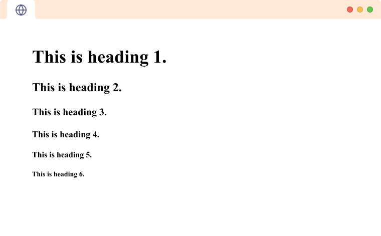
If the heading is NOT a <h1> tag, meaning the text looks like <h1>Your Heading Text Is Here</h1>, then you need to get in touch with your theme author (to slap them) or, better yet, find a developer to fix it.
The H1 tag should be the main keyword you are targeting for that page. This will either be the product name or a keyword that explains what the page is about.
Write a strong page title
Woah, hang on? The page title and main heading… aren’t they the same thing?
Well, the short answer is: sometimes. But sometimes you might want to make this shorter or more closely aligned to your keyword than you can make your product’s title.
It’s the second most important thing to get right regarding SEO for your store.
The Page Title (sometimes called the Title Meta) is the set of words shown on the tab in your browser. It’s also a hint to the search engines of what to use as the blue-linked text in the search engine results.
The length varies because, contrary to popular belief, it’s based on the width of the characters in the sentence, not the number of characters.
Since Google is moving to mobile-first indexing, it’s important to use a tool that will help you calculate the optimal page title length.
Craft compelling meta descriptions
While a custom meta description will NOT affect your rankings, it does indirectly.
When you set the page meta description, you are giving Google a suggestion of what to use in the description part of the search result. The visual representation of this can affect the conversion rate of the search result listing. This, in turn, affects the ranking because listings that are clicked on are more likely to appear higher in the rankings.
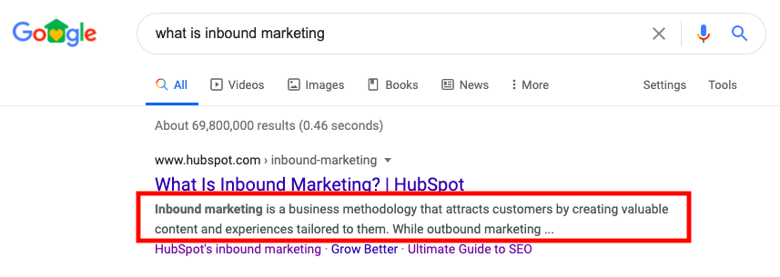
Long story short, set a custom meta description for each page that sounds nice and will get people to click through to the article. This will optimize ecommerce website and drive traffic to your store.
Optimize product descriptions
Product pages need to cater to several different types of people. Among them are the “data-hungry” folks who want lots of information to chew on.
The idea behind providing a long-form description and your short description is that the search engines know about this “data-hungry” crowd. They know they love extra information if it’s available.
I know it’s a lot of work to provide long descriptions for ALL of your products, but once you do it, you will be rewarded with better product pages and rankings. To save time (and avoid content fatigue), you can use AI-powered tools like StoreAgent to generate high-quality descriptions at scale. You can:
- Use StoreAgent’s Product Description Assistant to instantly create SEO-optimized product descriptions based on key product details.
- Use StoreAgent’s Product Summaries Agent to generate short, compelling overviews that help highlight key benefits for quick-scanning shoppers.
Check it out in action:
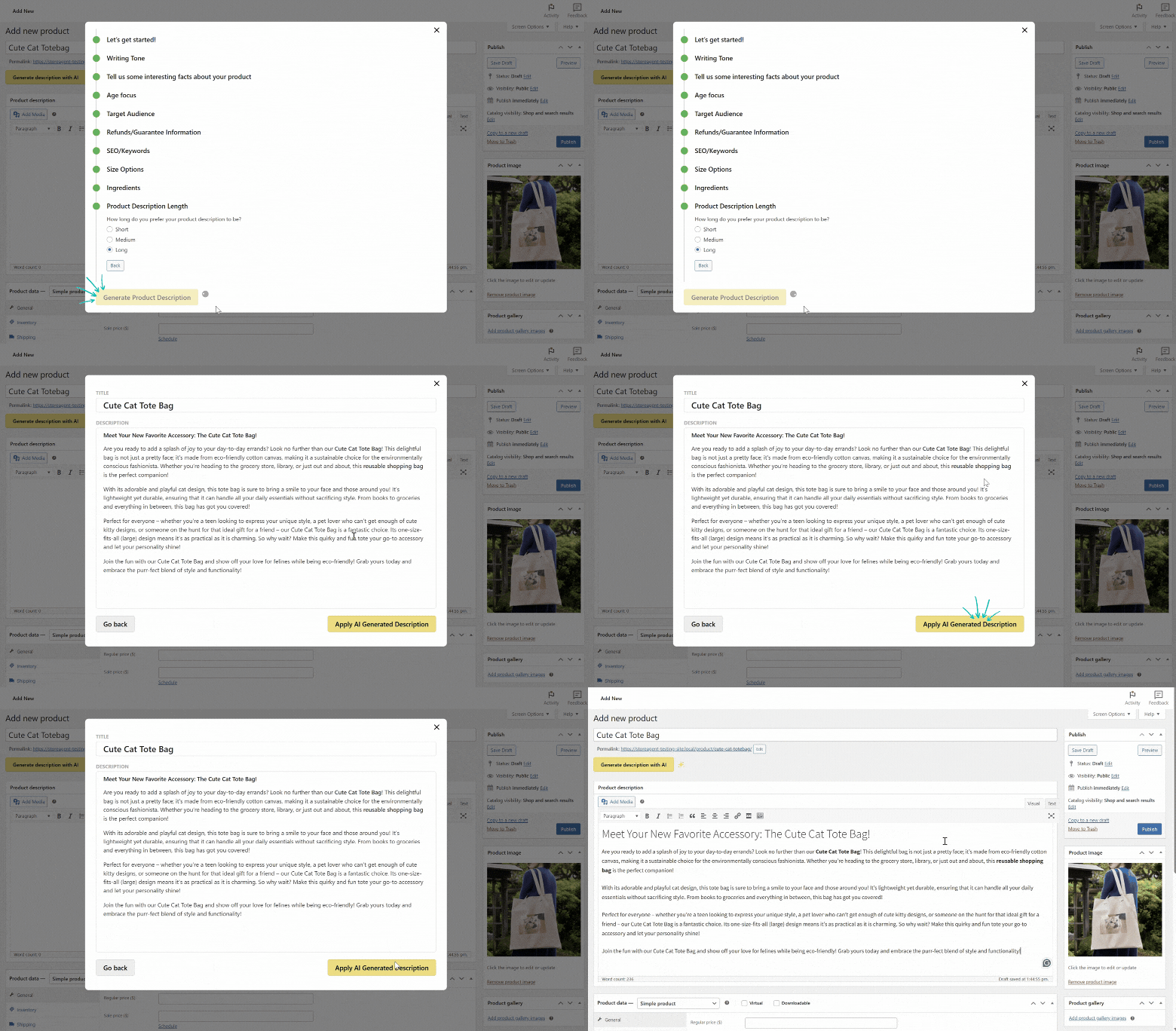
StoreAgent can automatically insert your main keyword(s) into the descriptions, so you don’t have to worry about optimizing them manually.
Not only is this good for your customers, but search engines also pick it up!
Enhance product pages with videos and imagery
This part is subjective, but based on my research, and has consulted on hundreds of e-commerce websites and seen thousands of stores via the products we sell, giving your customers images and video is just as important as providing long-form descriptions.
Just as some people are “data-hungry,” another segment is what I call “visual learners.”
These are the types of people who learn better by doing and seeing. If you can give them that experience with your products, you’ll be ahead.
Great product images, 360-degree views, and especially video are the best way I know how to cater to this segment of your audience. You can use AI tools like an AI image studio to easily create stunning eCommerce product photography.
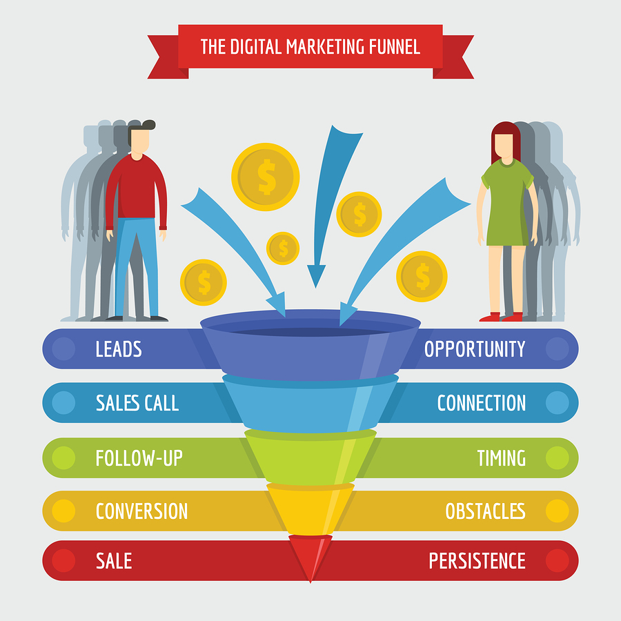
3. Build your sales funnel
What is a funnel?
A funnel is a set of steps describing the journey your customer goes on to become a paying customer.
The more you know about these steps, the smarter you can be about acquiring customers.
You are qualifying people and narrowing them down to those who will become customers.
Let me illustrate with an example set of funnel steps:
- Customer searches for a topic related to your industry
- They land on a blog post on your site because you rank well for the term
- When they go to close the page, they see an Exit Intent lightbox popup
- This leads them to enter their email in exchange for a free bit of information
- The information talks about your products
- They’re browsing around on Facebook later the next day and see one of your remarketing ads for a product related to the information they opted in for
- They come back to your site and hit the product page
- They find it resonates with them, and it solves the problem, and ends up adding the product to their cart and checkout
- This leads to them becoming a customer
- They see an email from you a month later and come back and buy more
Once you have a funnel like this, you can focus on filling up the top of it with as many people as possible.
Can your store have multiple funnels? Absolutely. And it probably already does.
🎯POWER TIP: Use tools like OptinMonster to capture more leads at the top of your funnel. You can easily create eye-catching pop-ups or embedded forms that collect customer details without disrupting their shopping experience. These simple opt-ins help grow your list and gently guide visitors toward their first order!
Think about every single way a customer can get to placing an order and work your way backward to the funnels that can be manipulated easily.
You want to find the easiest funnels to manipulate because then you can start working on getting more people through each step. That’s how you optimize ecommerce website.
4. Improve product page conversions
One of the biggest leverage points to optimize ecommerce website is your product pages – that’s why I’ve already spent quite a bit of time on them.
Many of the suggestions I made in Improvement Area #2 above (SEO) are similar to what you need to do here. To recap, here are the top 3 that you need to do first:
- Have awesome product descriptions (both long and short)
- Cater for different types of people (some are visual, some are data-driven)
- Apply your SEO best practices religiously (to every page on your site)
After you have done this, two other areas can really help the conversion rate of your product pages.
The first might seem very simple, but stick with me. We’re in the weeds now, right down to the tactics.
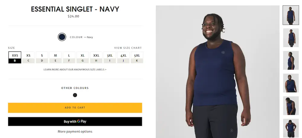
Make your “add to cart” buttons stand out
So many designers use flat, nondescript boxes that don’t look clickable. Sometimes they’re even a weird shape. They also make the mistake of making their button color the same as the rest of their design.
Ideally, your add-to-cart buttons should stand out and look like buttons.
I recommend that your “action” buttons throughout your site should be in a color that is complementary to your site’s color scheme. You can use an online color wheel tool to figure that out.
Not sure if you have good enough buttons? There’s a quick and easy test that you can do.
Load up a typical product page on your site, get up from your chair, and stand on the other side of the room. If you can’t discern the button from the rest of the layout, you have a problem, and you should be on the phone with your web designer ASAP.
Simplify your product pages
Nothing distracts a person more from the task they’re meant to be doing than giving them a hundred different options. Declutter your product pages, so the options are clear and simple and only include what is necessary for the page.
This goes for your sidebar too.
Ideally, you should also literally use negative space (aka white space – the space surrounding an object or section on your page) to optimize ecommerce website.
Giving things more negative space means it has breathing room and can be easily visualized by the eye. This, in turn, makes it feel less confusing.
💡 Bonus Tip: Page speed impacts conversions. Optimize WooCommerce speed by compressing images, using a CDN, and avoiding bulky plugins—especially on product pages.
Answer customer questions
Even with detailed product descriptions, some shoppers still have questions in their minds, especially if you’re selling a technical product, a high-ticket item, or something new to the market. If customers don’t find the info they need, they’ll leave and might not come back.
You can give shoppers more confidence to add to cart by making your product pages interactive and helpful. StoreAgent’s Product Questions Agent enables you to add an interactive Q&A tab to your product pages to give customers instant answers based on your product information.
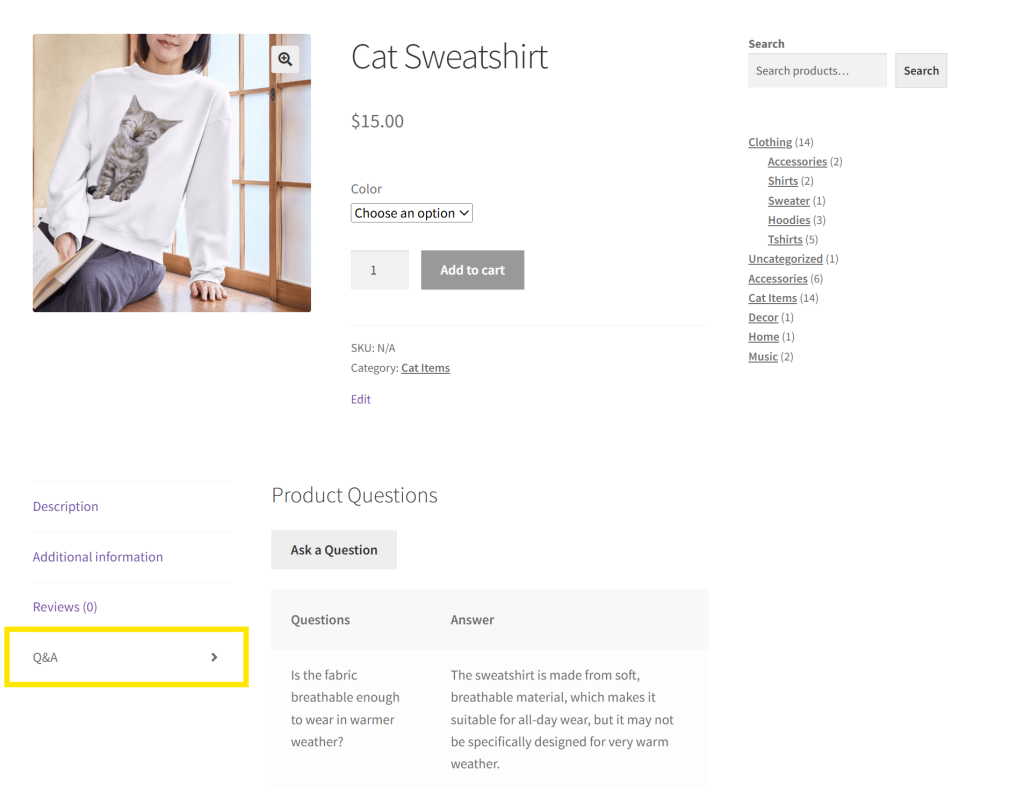
You’re in control–each response can be reviewed and approved before it goes live, ensuring accuracy. This saves you time and enhances customer satisfaction because they get answers instantly.
5. Enhance the checkout experience
Do that now if you haven’t measured your cart and checkout conversion rates.
How? It’s quite simple.
- Go to your Google Analytics and drag the date selector to cover a few months
- Go to the Behaviour section and view the visits to your cart page, your checkout page, and your order received page.
- Checkout Visits / Cart Visits * 100 = Cart to Checkout conversion rate percentage
- Order Received Visits / Checkout Visits * 100 = Checkout to Order conversion rate percentage
Once you know these numbers, you can start to optimize ecommerce website with the following:
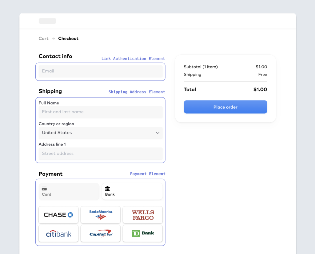
Offer multiple payment options.
For some reason that I haven’t been able to 100% figure out yet, some people hate particular payment providers (often for no logical reason at all).
For example, they might hate paying with their credit card directly via Stripe (god knows why it’s amazing) or hate PayPal fiercely (usually due to a bad experience in the past).
The solution, I find, is to give them two payment options. I do this on all my sites using both PayPal and Stripe payment gateways. You can use any other payment gateway than your “main” one and get the same effect.
Just having the second option seems to take away that friction point and optimize ecommerce website.
Be transparent about shipping costs
The absolute best way to remove any objections about shipping is not to have any shipping costs.
But if you can’t do that, be upfront about them as early as possible.
Ideally, if you can do it, geolocate the person visiting your store and give them a shipping estimate on your cart page before they even get to your checkout page and enter their shipping details.
🎯POWER TIP: If offering free shipping is too costly, consider using shipping discounts instead. Plugins like Advanced Coupons allow you to easily create shipping discount coupons that apply based on cart total, product category, or customer role. This gives you more control over the costs of your promotion while still removing friction at checkout.
Remove distractions
If you haven’t done conversion optimization activities before, these next suggestions might seem extreme.
I want you to remove ALL unnecessary distractions from the checkout page and, ideally on the cart page. This will optimize ecommerce website by miles!
Examples are:
- The main menu in the header of your site – your header should contain only your logo (the logo should be clickable)
- The footer menu (you can leave the copyright notice and anything else that is not clickable that you want there)
- Any fields on your checkout form that aren’t necessary for the transaction
- Any unnecessary buttons or text that distract from the form or complicate things
This will make your checkout page a streamlined form, and there will be nothing else clickable.
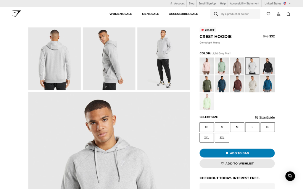
In my testing, this provides the best conversion rates on a checkout page (in any industry). My theory is that by the time they get to the checkout page, they’re there to do one job: to put their information in and give you their money so they can get their stuff.
Your job is not to bugger up that process!
The common question is, “Is it OK to have a button that says Continue Shopping?” Of course, it is!
I recommend you put this up the top of your page and give them that option to get back to where things have menus and things to click on. The rest of the page should have no other distractions from the task they’re there to do.
Frequently Asked Questions
What is eCommerce website optimization?
eCommerce website optimization entails improving key aspects of your online store to boost its visibility in search engines and enhance the overall shopping experience. Some key aspects to consider include website layout, product page quality, mobile-friendliness, checkout, and load times. The goal of website optimization is to make it easier for customers to browse, find what they need, and complete their orders.
How can I improve my eCommerce website?
To improve your eCommerce website, focus on elements that directly improve the user experience. This includes optimizing your product pages, publishing quality content, ensuring easy navigation, and simplifying the checkout process.
You can use tools like StoreAgent to automate key tasks such as generating product descriptions and summarizing reviews. These automations helps you save time and reduce manual work.
How can I improve my ecommerce website SEO?
Improve your website’s SEO by adding proper meta titles, meta descriptions, and headings on your pages. Research relevant industry keywords in your niche and naturally include them in your product descriptions, blog posts, and other content.
You can build your authority by regularly publishing helpful content that your audience are searching for and optimizing your website’s site speed, structure, and mobile-friendliness.
Conclusion
If you want to optimize ecommerce website, chunk it down and focus on areas that will create the biggest impact for your store. With consistency and the right tools, you’ll be surprised how much your store can grow.
I hope you have found some actionable information here. To recap, we shared 5 ways to optimize your WooCommerce website:
- Simplify the customer experience
- Optimize for SEO
- Build your sales funnel
- Improve product page conversions
- Enhance the checkout experience
I recommend going back through your notes and picking an area of focus. Make that your priority for a whole month and see what you can do to improve it. A lot can happen in a month. You might be surprised how it affects your revenue!
Do you have any questions about this article? Let us know in the comments!

