In e-commerce, every single click and page transition matters. It’s like guiding someone through a store – every turn they take could lead to a purchase or just walking out empty-handed. When someone lands on your WooCommerce cart page, it’s not just a random pit stop.
It’s a crucial part of their journey toward purchasing. This is where shoppers pause to review what they’ve picked out, think about quantities, and decide whether to buy or not.
In this guide, we’ll show you how to make your WooCommerce cart page more than just a place to hold items. It’s about turning it into a powerhouse that boosts your sales. By getting the right mix of features, you can make your cart page look professional and nudge customers towards completing their purchases, coming back for more, and spreading the word about your store.
So, let’s dive deeper into it!
7 Key Features Of An Effective WooCommerce Cart Page
A well-structured cart page can provide a seamless transition from casual browsing to order completion.
When you prioritize the user experience on this page, you’re effectively removing any obstacles that might stand in the way of a sale. After all, this is the final threshold before a customer commits to the purchase. Making sure that it functions smoothly and intuitively is crucial for minimizing cart abandonment and maximizing revenue.
That being said, let’s break down some key things to keep in mind when setting up your WooCommerce cart page in a way that feels welcoming and easy to navigate:
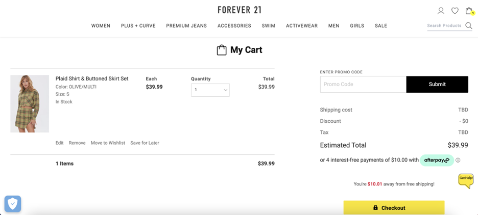
1. Clear product details
Make sure your customers can easily see all the important details of the products they’re interested in buying, like:
- clear images,
- product names,
- color or size options,
- prices,
- and quantity.
Keeping this information visible helps customers make informed decisions without having to leave the cart page. For more details, check this guide.
2. Real-time updates
Give customers the ability to adjust quantities or remove items from their cart without having to reload the page. This feature, powered by AJAX technology, adds a level of convenience that modern shoppers appreciate, leading to higher satisfaction and more completed purchases.
3. Security assurances
Address customer concerns about online security by prominently displaying SSL certificate badges, trust seals, and a clear privacy policy. These visual cues help build trust and reassure customers that their personal and payment information is safe with you.
4. Intuitive layout
Creating a layout that feels natural and easy to navigate is key.
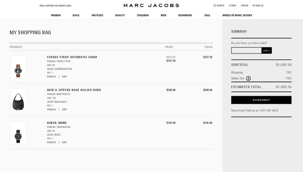
Think about how you arrange everything on the page – put the cart summary where it’s easy to find and make sure the checkout button stands out so customers know where to go next. Keep things tidy by only showing what’s important, like making it clear how to apply a discount or move on to checkout.
BONUS: Incorporate visual hierarchy
Additionally, visual hierarchy is another helpful trick.
By using different sizes, colors, and positions, you can guide shoppers’ eyes to the important stuff, like showing them where to check prices, see the total cost, and hit the checkout button. It’s a subtle way to help them along and make the whole process smoother.
5. User and mobile-friendly interfaces
Make sure all buttons and interactive elements are large enough to be easily tapped on mobile devices.
Mobile users should have a seamless experience navigating your cart page, without struggling to select options or enter information.
Quick load times are also essential for mobile users, so optimize images and minimize heavy scripts to keep things running smoothly, even on slower connections.
6. Streamlined checkout process
Let’s keep things simple at checkout. The smoother and quicker the process, the happier our customers will be. Long, complicated steps can discourage people from finishing their purchases.
So, think about simplifying things – maybe with a one-page checkout or by letting customers check out as guests instantly:
PRO TIP: While it’s great to offer guest checkout, there are perks to having an account, like faster future checkouts and order tracking. Consider sweetening the deal with incentives, like discounts or loyalty points, for customers who sign up during checkout.
7. Upselling and cross-selling campaigns
Finally, and most importantly, have upselling and cross-selling strategies in place.
The goal is to turn our cart page into a sales powerhouse, so you must grab every opportunity to suggest more goodies to your customers. Here are some ways you can do this:
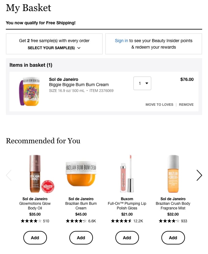
Product recommendations
Highlight related products or accessories that go well with what’s already in the cart. It’s a smart way to increase the value of each order:
Just make sure these recommendations add real value to the shopping experience.
Limited-time offers
Nothing beats an adrenaline rush.
Create a bit of urgency with limited-time offers on items they can add to their cart. It’s a tactic that can push customers to make extra purchases they might have put off otherwise.
PRO TIP: Advanced Coupons lets you easily set sale or coupon schedules. Check out our full guide here.
Bundles and discounts
Everybody loves a good deal, right? Promote bundles or offer discounts for buying multiple items. It’s a win-win – more sales for you, and customers feel like they’re getting a bargain.
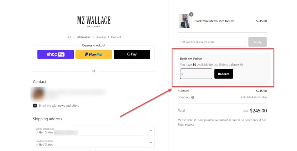
Loyalty program
Let customers know about the points they’ll earn with each purchase. It’s a little push to get them to finish up the sale, plus it helps keep them coming back.
Additionally, displaying their loyalty points balance can encourage them to spend more – or use those points and earn even more. It’s a cycle that keeps them engaged!
How The Advanced Coupons Plugin Can Enhance The Functionality Of Your WooCommerce Cart Page
Imagine having the power to offer all sorts of exciting deals and discounts effortlessly. That’s exactly what Advanced Coupons brings to the table.
This powerful plugin enables you to offer a variety of coupon types beyond the basic WooCommerce functionality. This includes BOGO deals, loyalty program coupons, and coupons based on cart conditions, adding an extra layer of engagement and potential savings for your customers.
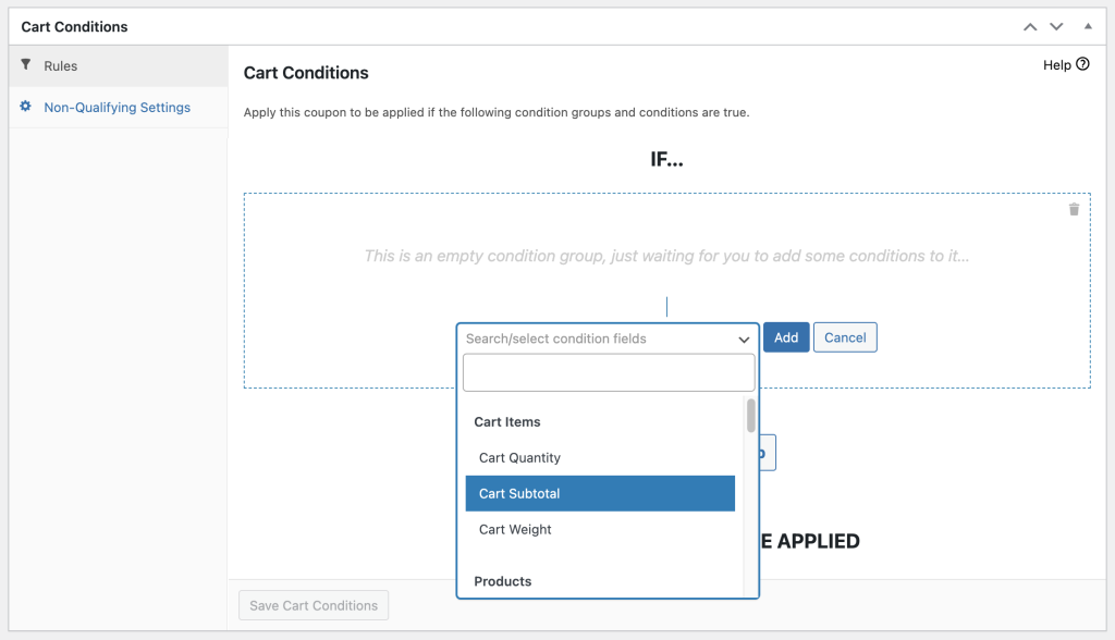
Cart Conditions
Advanced Coupons also allows you to set specific conditions that must be met before a coupon can be applied, such as a minimum spend. This encourages customers to add more to their cart to take advantage of a deal, thereby increasing your sales.
Most especially, this feature is all about making the shopping experience smoother for your customers. No more fussing around to apply discounts – it’s all right there on the cart page, making checkout super easy and convenient.
WooCommerce Loyalty Program
As discussed, loyalty programs are a fantastic way to keep customers returning to your store.
Advanced Coupons’ WooCommerce Loyalty Program gives you the ability to set up a flexible and reliable loyalty program in just 5-minutes.
Additionally, it gives you full control over how it looks and feels on your cart page.
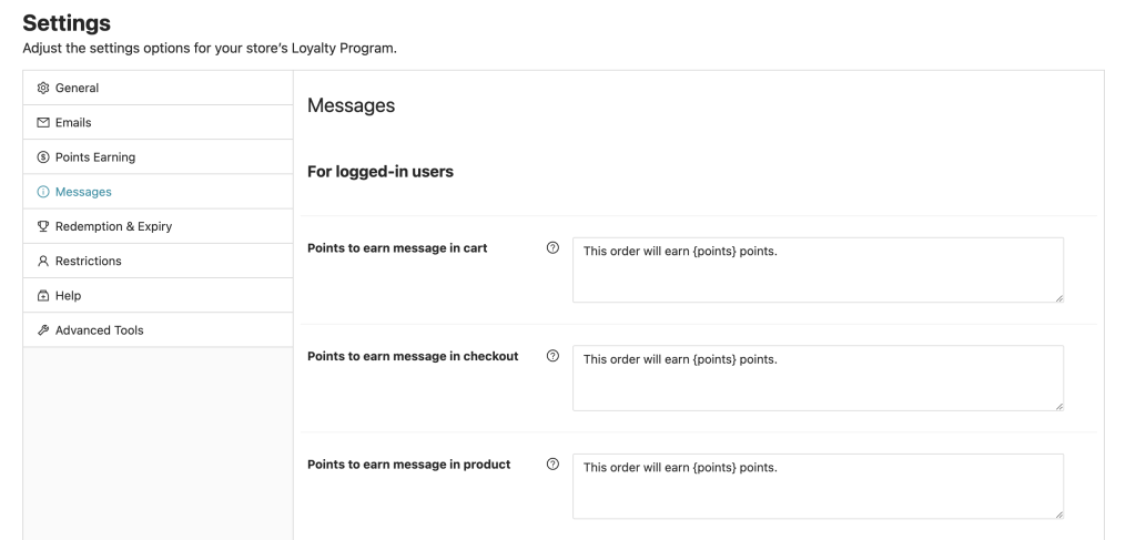
For instance, you have the option to display point notifications reminding your customers of how much they’ll earn for each purchase. To set this up, go to Coupons > Loyalty Program > Points Messaging:
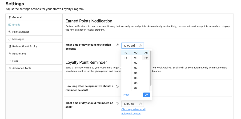
Finally, you can also send earned points notifications, confirming their recently earned points. Simply set this up under the Emails tab:
For more information on how to create your loyalty program using this powerful plugin, check this guide.
Conclusion
The WooCommerce cart page is more than a mere summary of a customer’s potential purchase; it’s the pivotal point that can make or break a sale.
In this article, we shared 7 key features of a WooCommerce cart page that will help you boost sales:
- Clear product details
- Real-time updates
- Security assurances
- Intuitive layout
- User and mobile-friendly interfaces
- Upselling and cross-selling campaigns
Then, we also shared 4 upselling and cross-selling techniques you can use to leverage this page using the Advanced Coupons plugin:
Do you have any questions about this article? Let us know in the comments below!

